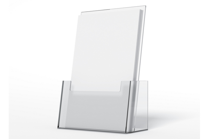
If you want your business to stand out in a visually appealing way, you need a brochure holder. The design of your brochures is as important as the content itself. From the typeface, content, images and layout, a professionally created brochure is a mobile vehicle that presents both your message and brand in a professional manner.
A professional brochure in a customer’s hands is a compelling marketing tool. However, in a field saturated by too many brochures, yours must stand out to make an impact. Fortunately, it is not difficult to come up with a high impact brochure that draws to itself the attention of potential customers when placed in a brochure holder. Below are six effortless ways to make your brochure stand out.
1. Beautiful Design
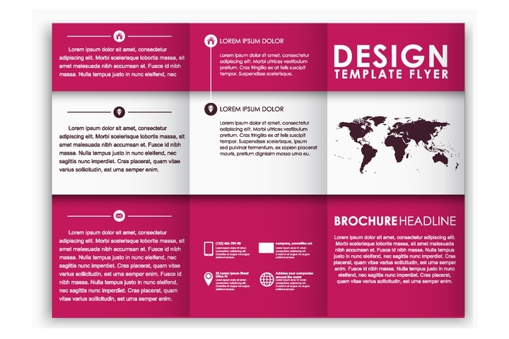
The aesthetics of your brochure such as beautiful colours and a creative design plays a major role in the success of your business. Some of the features of a great brochure include large, full-colour images, impeccable branding, layouts that are easy to follow, ample white spaces, and a creative design.
2. Compelling Copy
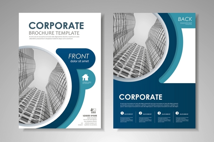
The copy of a brochure must speak to your audience in a clear and compelling way. Present critical customer benefits in large headlines and other not-so-critical ones in bulleted lists. Your copy should also feature a prominent call to action that leaves customers without a doubt what to do next.
3. Premium Paper Stock

For your design to stand out on a brochure holder, use a thicker paper stock such as 100 lb that looks and feels wonderful in a customer’s hands. For that extra edge, you can use 100% eco-friendly recycled paper. Your paper stock’s statement concerning your brand speaks louder than the content it carries. It can be the only difference between a brochure that immediately ends up in a trash bin, or one that motivates a customer to make a follow-up call or send you an email.
4. Binding and Folding

How you bind or fold your brochure is another difference maker. To make a statement, avoid the tired trifold by using z-folds, accordion folds, half folds or double-gate folds that instantly demand attention. With these unique fold designs, you will create a compelling impression that will stick with clients for a long time. You can push the design of your brochure further by printing them in multi-page bound booklets that make your company poignantly stand out.
5. Size of Brochure
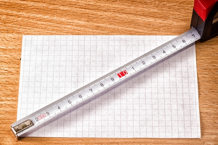
The commonly used brochure paper size is 8.5” x 11”. Consider deviating from the norm by printing extra large ones. Why not consider 8.5” x 14”, 11” x 17”, or 11” x 25.5” brochures. Larger brochures are highly effective attention grabbers.
6. Interactivity
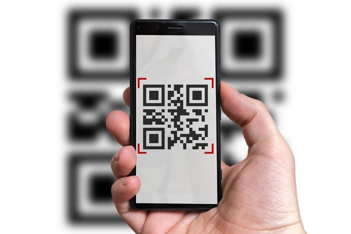
You can have more impact by adding some interactivity to your brochures. For instance, you can add a QR code to redirect customers to your social media platform, mobile app, or your website. To nail it unequivocally, consider applying augmented reality to allow customers 360-degree product views and access to informational videos and other resources. Effectively implemented, augmented reality could quickly turn potential customers into actual buyers.
There are so many marketing tools in the market competing for the ever-dwindling customers’ attention span. For a brochure to stand any chance in this highly competitive marketplace, you need to go the extra mile. Be as creative as possible in designing a brochure that resonates with your target audience. Everything from design, paper stock, size, copy quality, binding or folding have to be perfect. At the end of the day, it’s the brochure that is picked and read that stands the best chance in the marketplace.

